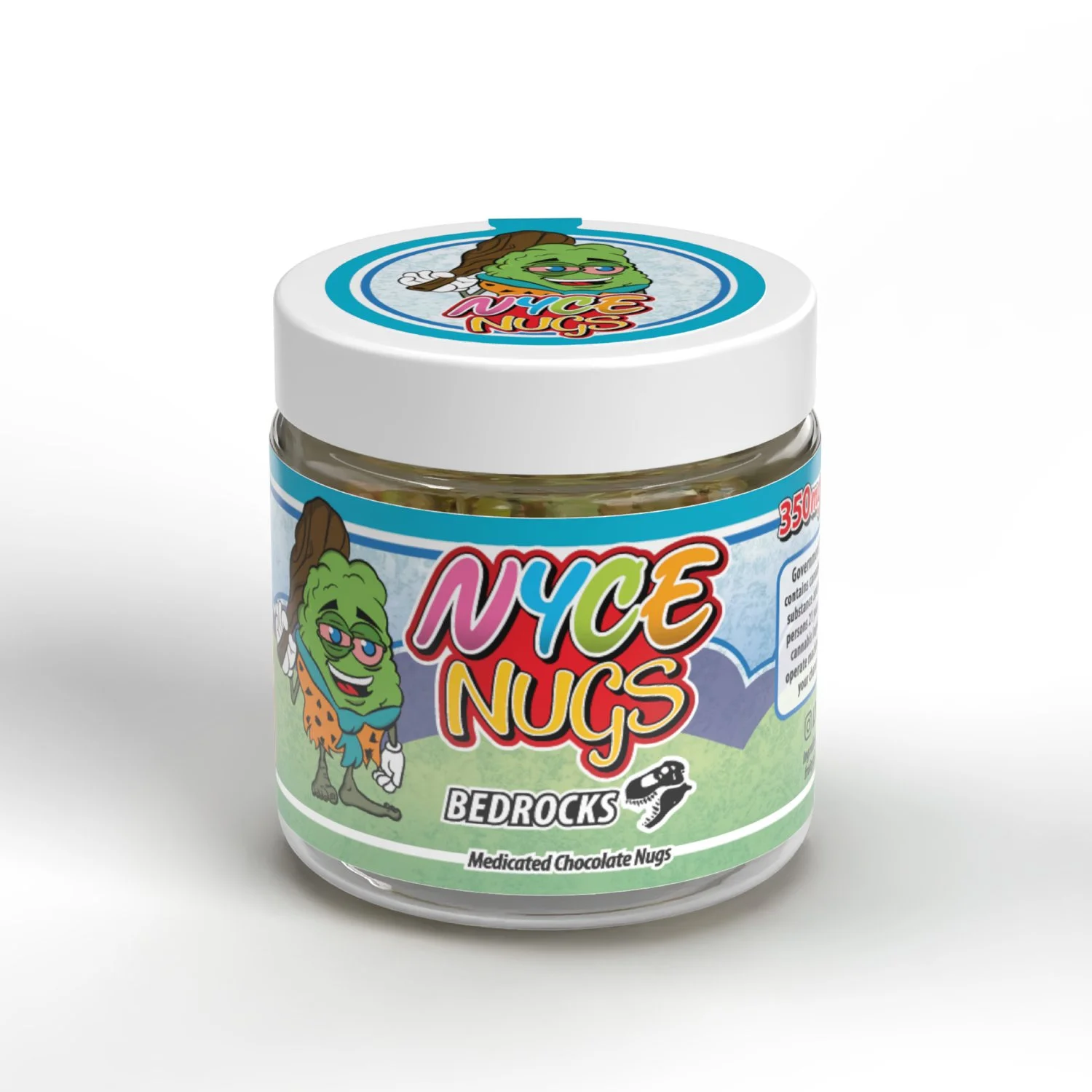
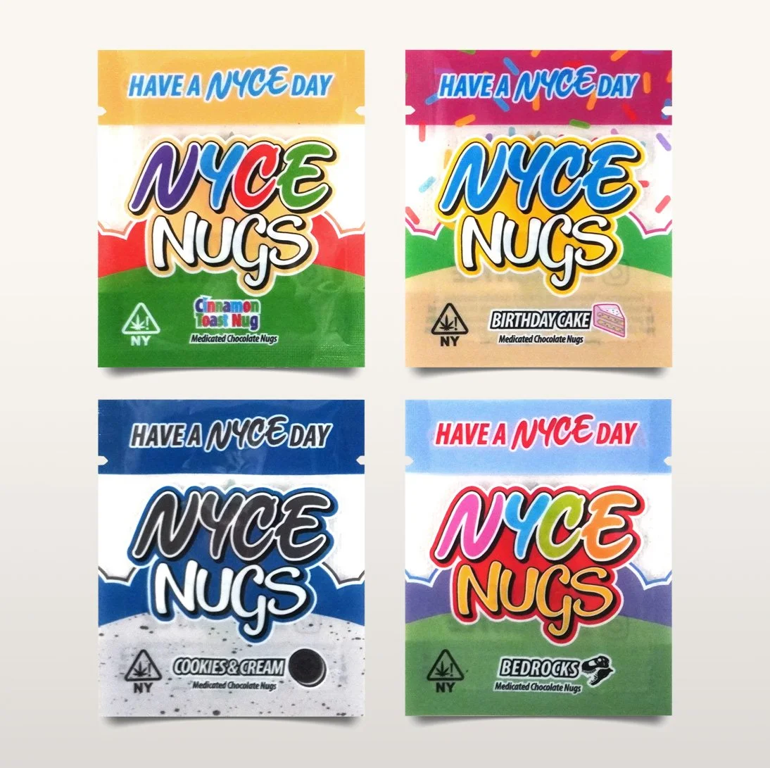
NYCE Nugs Medicated Chocolate Nugs
Branding & Label Designs
The team at a cannabis lifestyle startup called N.Y.C.E hired me to brand their line of medicated chocolate product, NYCE Nugs. The designs were established working closely with the founder to translate his vision to a working reality. Mascots for this project were provided by NYCE and were incorporated into the label artworks. Each flavor carries its own version of the mascot, color theme, typography, and iconography. A two-piece label template was conceived across a dozen flavors featuring a tamper evident lid label. The label along the barrel of the jar is short enough where the ends leave space for the tamper evident tab to secure to the jar. Their tagline "Have a NYCE Day" is displayed on the tab across all varieties in different colors.


Fuel Tank Cannabis Extracts
Brand & Label Designs
Local cannabis extracts distributors, Fuel Tank, came to me looking for branding and labels designed for this line of product. The logo I had made for them earlier in the year featured an old fashioned gasoline pump in a muted red tone with a cursive logotype within. Across the packaging conceived for this brand, the idea was to appear on packaging in a strong minimalist triad of red white and black. The typography was set up in tall condensed letters inspired from the kind you may see on automobile's license plates. This first product comes two varieties known as Sugars and Badders in small cylindrical jars measuring 1.25 inches wide. Our jar label is run on a metallic substrate and covers the entire lid. Color gradients appear along the perimeter of the labels that vary enough for vendors to readily identify.

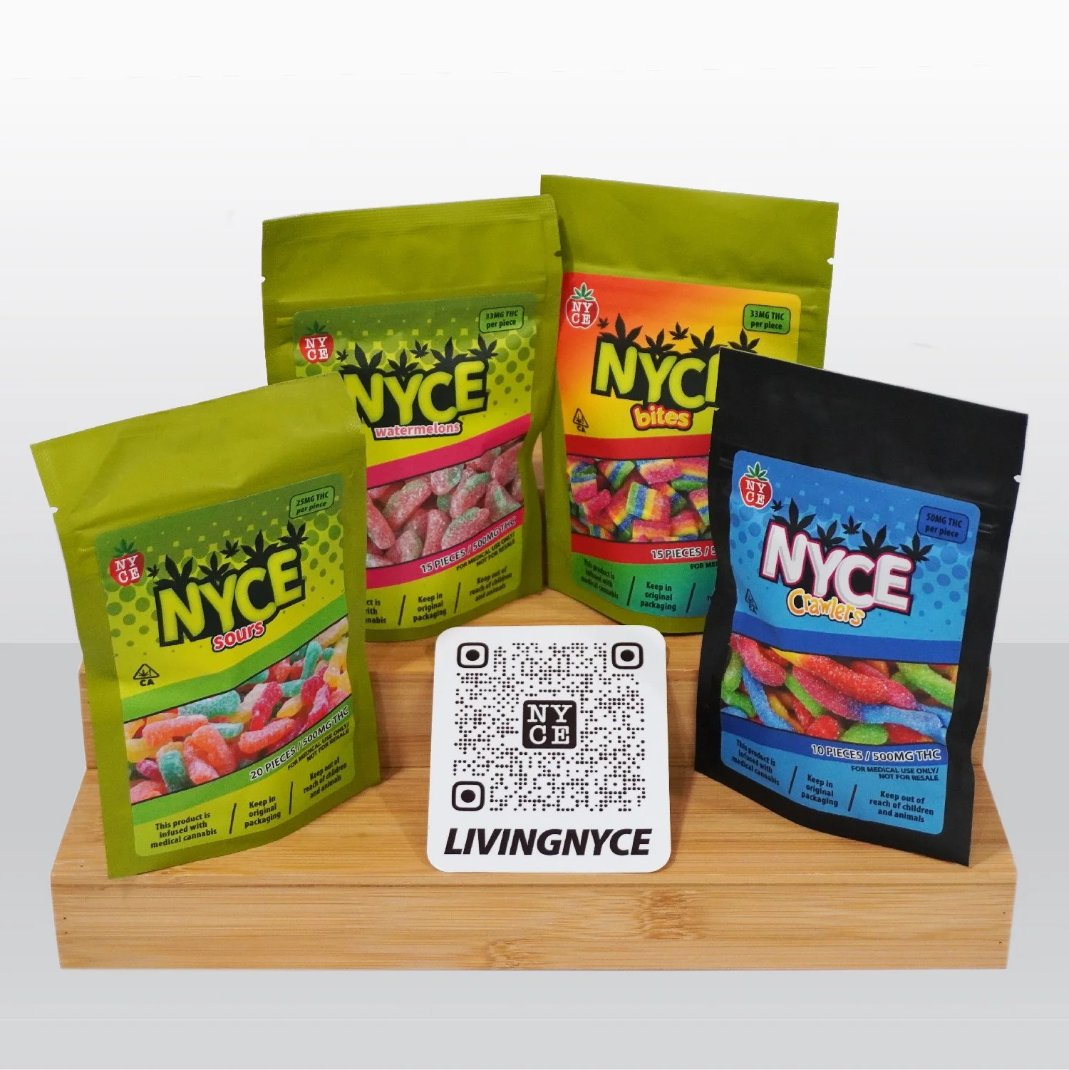
NYCE Brand Infused Gummy Candy
Brand & Label Designs
One of this brands’ earliest endeavors was these medicated gummy candies and I was commissioned with to design refreshed branded labels for mylar bags. Concept consisted of a stylized NYCE logotype with cannabis leaves coming out of it to reinforce the fact this isn't ordinary candy. Each variety of gummy is accompanied with its own logotype heavily influenced by the original candy art. A 'fake window' in the design allows vendors and consumers to readily identify the product. Appropriate warnings and dosage information relegated to the bottom quarter of the label.
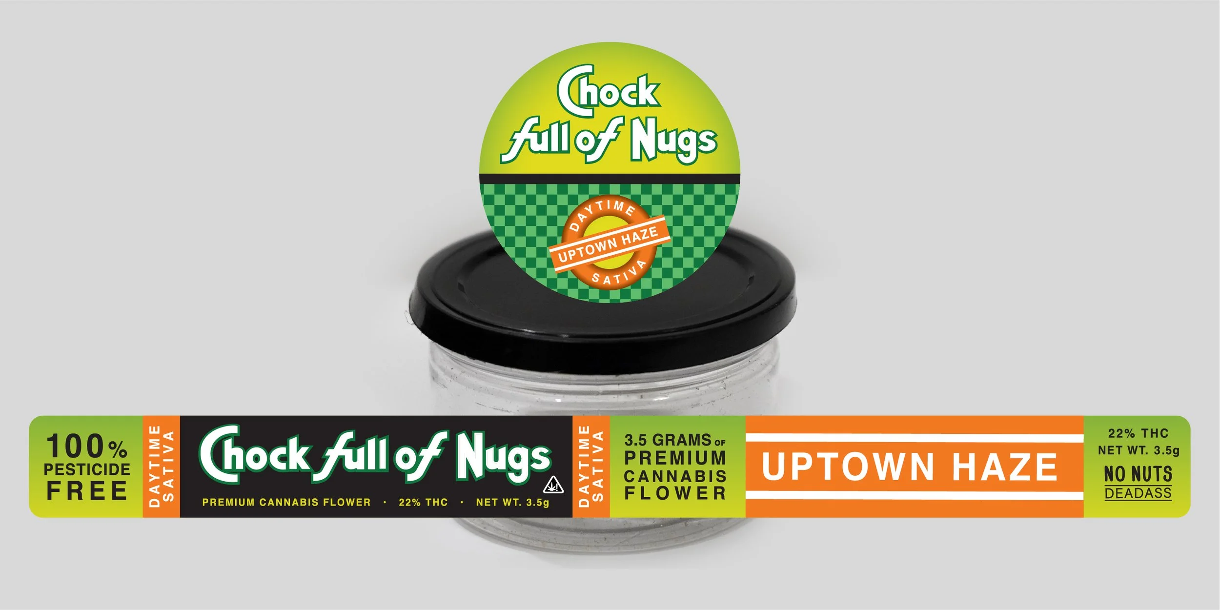
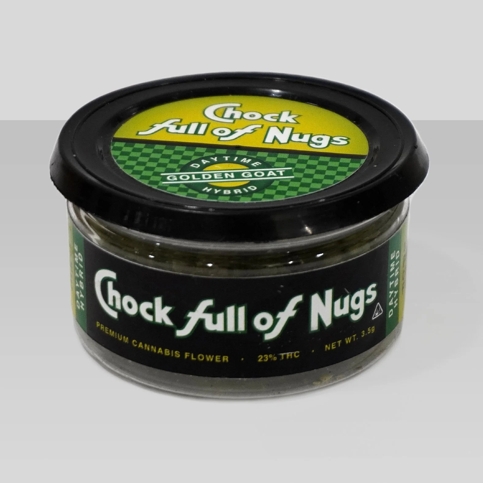
Chock Full of Nugs
Brand & Label Designs
This was a project in late 2018 that never made it to full production. A New York based entrepreneur was looking to start a cannabis brand with strong New York attitude. I made efforts to come up with the name and the subsequent designing. A classic idiom associated with New York, "Deadass", was added to the design to reinforce the New York attitude. In a typical black market fashion, we appropriated the appearance of an iconic New York Brand dating back to 1926. Our design involved a color scheme that organized ten strains into three categories, to be featured on both the lid and jar for quick identification.
Whopper Dabs Premium Extracts
Brand, Packaging, Production
Florida based cannabis extract artist commissioned me to design and source a premium envelope for their extracted product. Client only provided their hamburger icon logo, which became prominently featured front and center. A logotype was created influenced by Burger King ad typography; appearing in massive, bold, capital, underlined letters with the letter 'E' stylized into horizontal bars dressed in traditional Rasta colors to communicate this is a cannabis product. The product description beneath is set in a contrasting typeface. A flaming grill image was inserted to fill the space along the front and hamburgers were tiled along the background. Logo and logotype are featured again on the flap so they appear on both sides of the envelope when it is sealed. Back side left blank to accommodate a sticker seal containing pertinent information about the extract. Along the back bottom a reminder to responsibly enjoy the product.

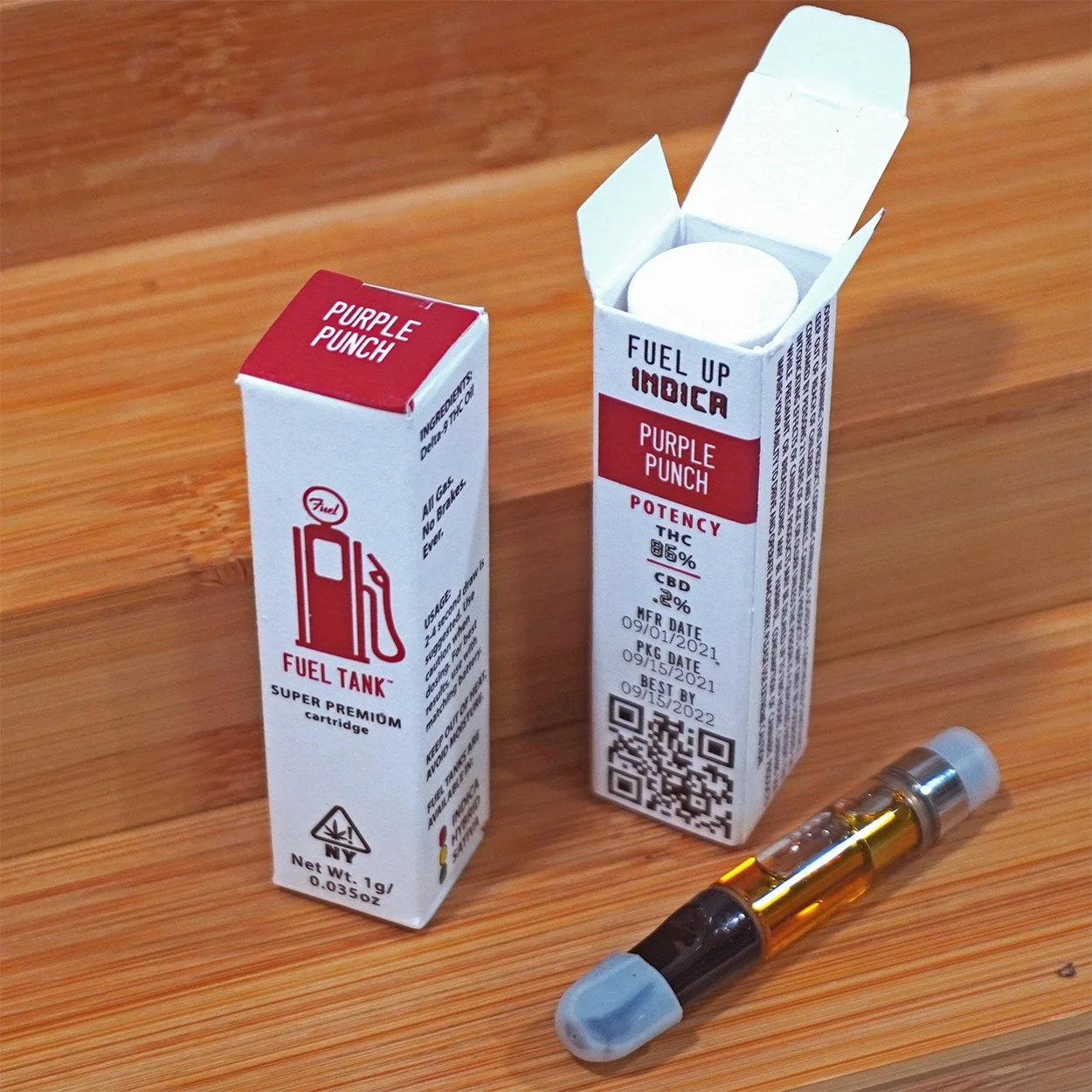
Fuel Tank Cartridges
Logo, branding, packaging, production
Local cannabis extracts distributors, Fuel Tank, came to me looking for branding and packaging solutions for their vape line of product. This project laid down the branding to eventually be used in other concepts. I determined to use a clean organized design across the collection.The imprint method along the coarse matte cardstock created a strong premium appearance, strengthening visual appeal. A silhouette resembling an old fashioned gas tank was created for the logo with Fuel written in cursive inside. Logo is paired with a typeface resembling license plate letters to reinforce the gas tank image. The words ‘Super Premium Cartridge’ appear on the front beneath the logo.
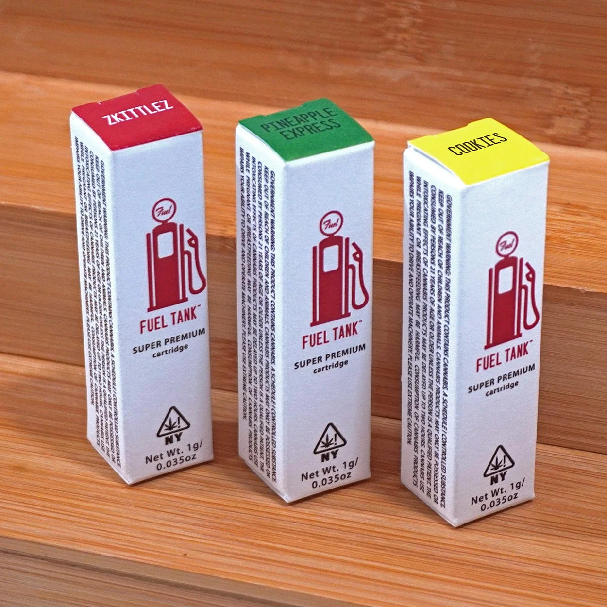
Keeping in the automotive theme, the colors of traffic lights inspired a color coding to indicate the varieties of available flavors. The color coding was applied to the lids of the boxes along with its specific flavor so vendors may quickly identify them when they are assembled and packed in their master box. Flavors listed on the lid are oriented so they may remain legible when consumers are holding and looking at the front side of the box. Sides of the box feature ingredients and appropriate usage information along with warnings required by the government. Backside of the box begins with a call to action, set in a digital typeface to playfully reference numbers on a dashboard. The flavor of the product is repeated within its color coding, followed by potency data, manufacturing date, packaging date, and best-by date stacked up. A QR code resides at the end of the box linked to the relevant testing data.
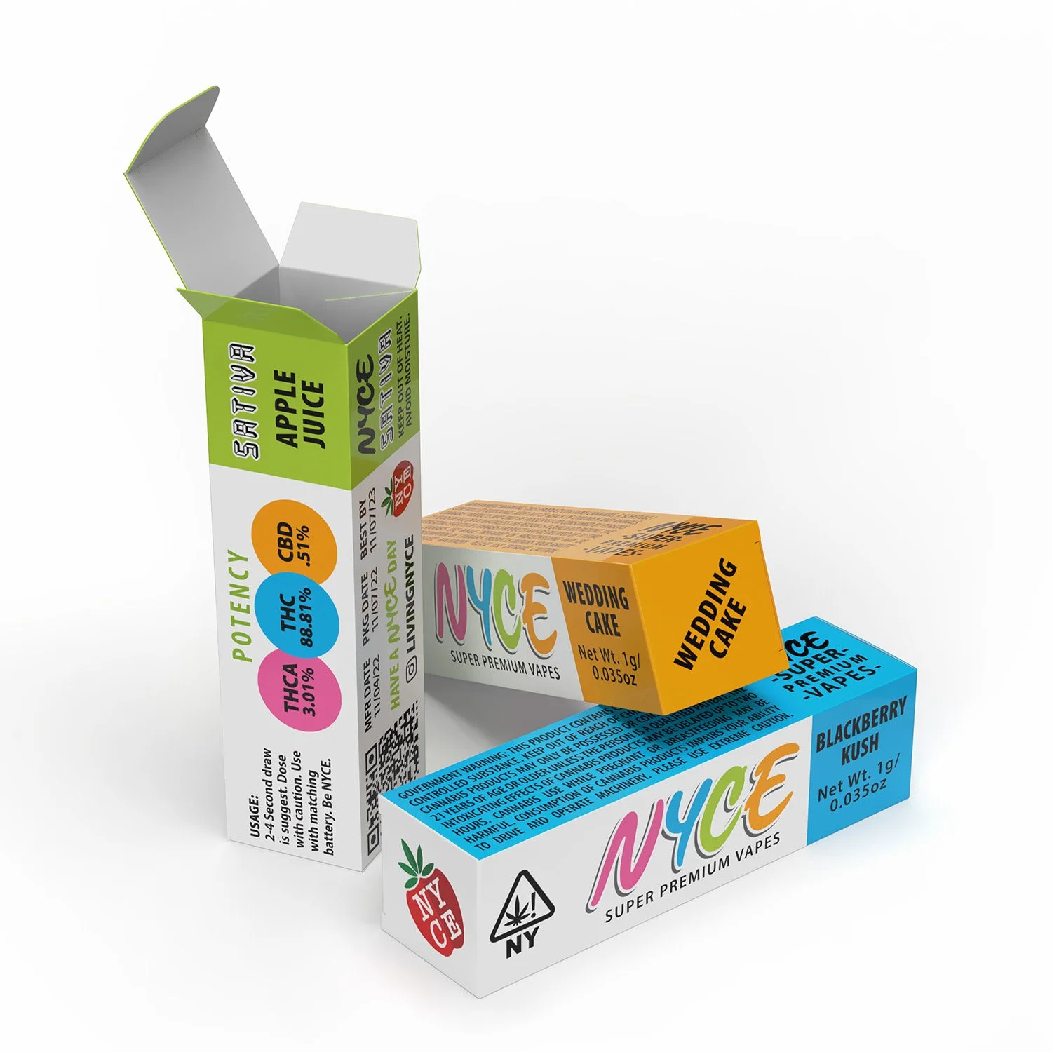
NYCE Premium Vapes
Branding and Package Designs
New York Cannabis startup, NYCE, hired me to spearhead branding efforts and establish package designs for their vape line. I sought to create something that can be organized neatly into varieties. We deviated from the cartoonish branding from their hit product Nugs and came up with a four color logotype. This concept featured in the images originally was not intended for full production; the original design featured a closing lid like a modern cigarette box. In the midst of delays the brand decided the artwork be translated onto a traditional box. Art features a horizontal format with top lid end color coded according to sativa, indica and hybrid varieties. Within this blue area along the sides is strain information and the lid features the name as well for immediate recognition in a master box. Potency information appears largely displayed on one side also color coded, and a government warning on the opposite end. The bottom lids of the boxes feature the classic NYCE Apple logo.
NYCE Nugs Free Sample Bags
Package Designs
As of today, spanning only the past two years, the NYCE brand has given away over ten thousand dollars worth of free samples across various cannabis events around the country. The samples at first came in blank plastic zip bags to playfully reflect cannabis culture during prohibition. Since then, the presentation of the samples has evolved and become more sophisticated and modern. These image reflect our third iteration of sample packaging. Across eight varieties, our sample bags are made of clear mylar and offer all relevant information written on it for consumers. On the front of the bag is proudly displayed the logo along with flavor and product description. A warning symbol on the front alerts a consumer of its contents. the slogan Have a NYCE Day appears on the top protion of the bag that is torn off. The backside artworks reiterate at the top in large letters its contents are medicated and dosage information is provided. Government warning is featured at the bottom of the design along with brand logo and Instagram.
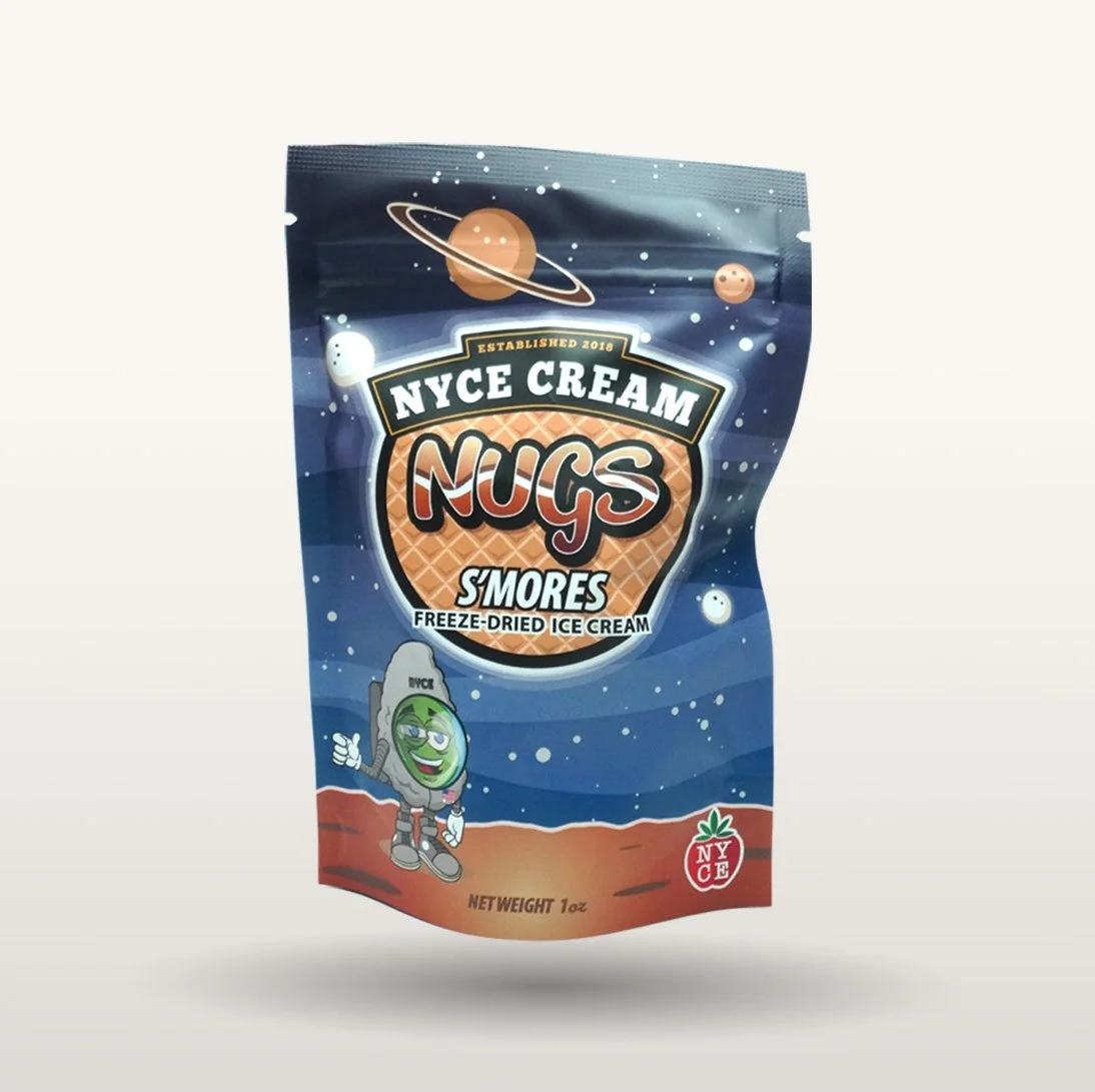
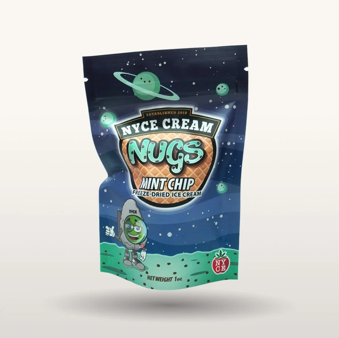
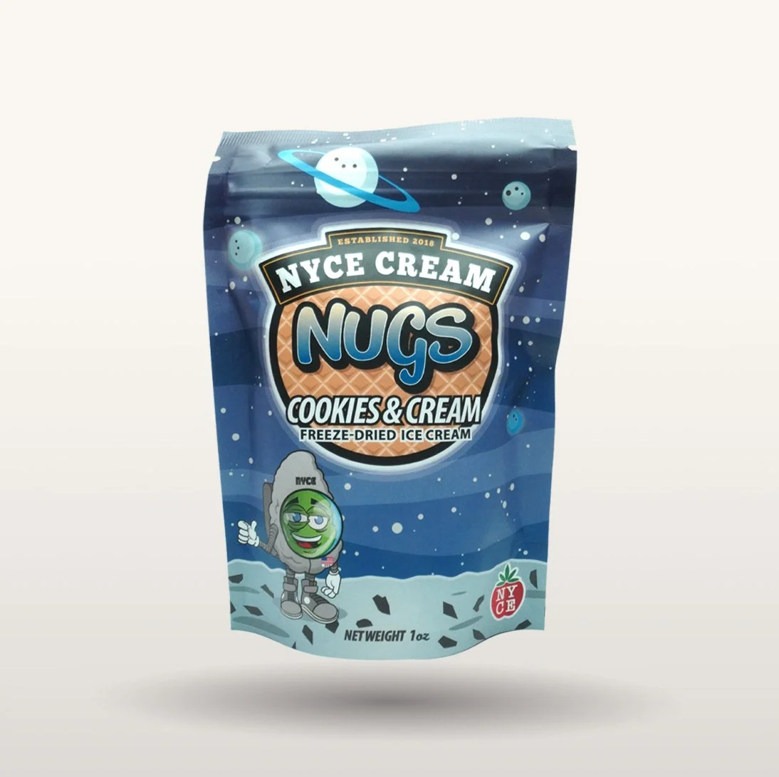
NYCE ‘NYCE Cream’ Nugs
Mascot, Branding, Package Designs
Leading up to the summer of 2022 NYCE brand engineered an award winning edible that was prefaced with unmedicated tests. Out of these tests was birthed NYCE Cream Nugs, a freeze-dried ice cream treat impervious to melting. I was employed to create a space suit for their mascot and a brand to go with a whole freeze-dried lineup to come. The treats came in over 15 flavors and each one featured its own artwork. The release of the NYCE Cream Nugs was timed with a social media campaign of three Instagram carousel posts and motion graphics.m After the first round of production of non-medicated treats, the bag designs received a mild refresh to feature their medicated counterparts. The shading in the planets and stars changed, became smoother and more colorful, while a purple tone adorns the sky across the medicated variety. Backside of the bags feature nutrition facts, slogan, and listed available flavors.
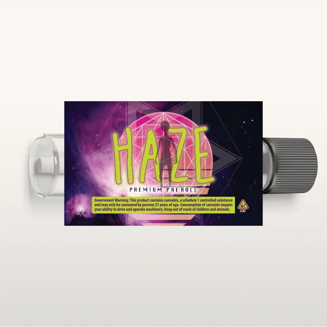
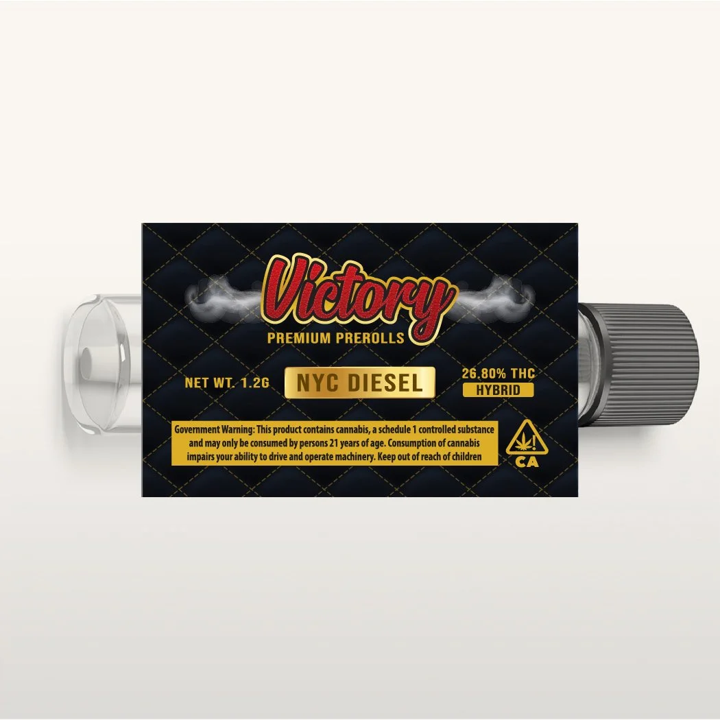
Assorted Preroll Labels
Logo, Brand & Label Designs
Multiple cannabis artisans have entrusted me with crafting identities for their small batch preroll offerings. Of the three samples illustrated only two of the designs required variable data; featuring potency, strain, and variety. Over the years, you can see a progression in what kind of information clients want to feature for their consumers.

Funginacci Enhanced Chocolate Bars
Logos, Brand & Package Designs
Funginacci is a project based out of California where it is commonplace to find chocolate bars medicated with psilocybin, a naturally occurring psychedelic compound produced by a variety of fungi. The product exists in three flavors, each with their own color themes. Pictured are two of these flavors, illustrating a ‘before and after’ of a mild brand refresh. The brands name is a word play on the Fibonacci Sequence — a ratio that for millennia has been rumored to have sacred, deep, and spiritual connections. The background of the artwork features this ratio tiled into a pattern lain across a tie-dye pattern to reflect its psychedelic nature. With the client, we determined clever names to include in a dosing chart for consumers and we dedicated one side of the packaging for a philosophic quote. The production featured offset printing on a metallic substrate to enhance the tie dye artwork and to turn the packaging into an entertaining piece for consumers once they are under the effects of psilocybin.

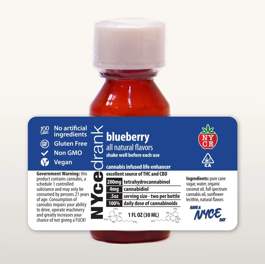
NYCE Dranks
Brand & Package Designs
NYCE Dranks is among the first projects i had with local cannabis startup brand NYCE. The brand concept aspired for a simple and sophisticated design that lent itself to many flavors. The branding for Dranks aimed to visually come across as something of a nutritional supplement. Molecular representations of the products’ psychoactive ingredient, THC, was implemented to aide in reinforcing that some sort of science was involved in the creation of the supplement. NYCE Dranks currently are available in fourteen flavors across single and four ounce varieties and a sugar-free line was even conceived but never executed.