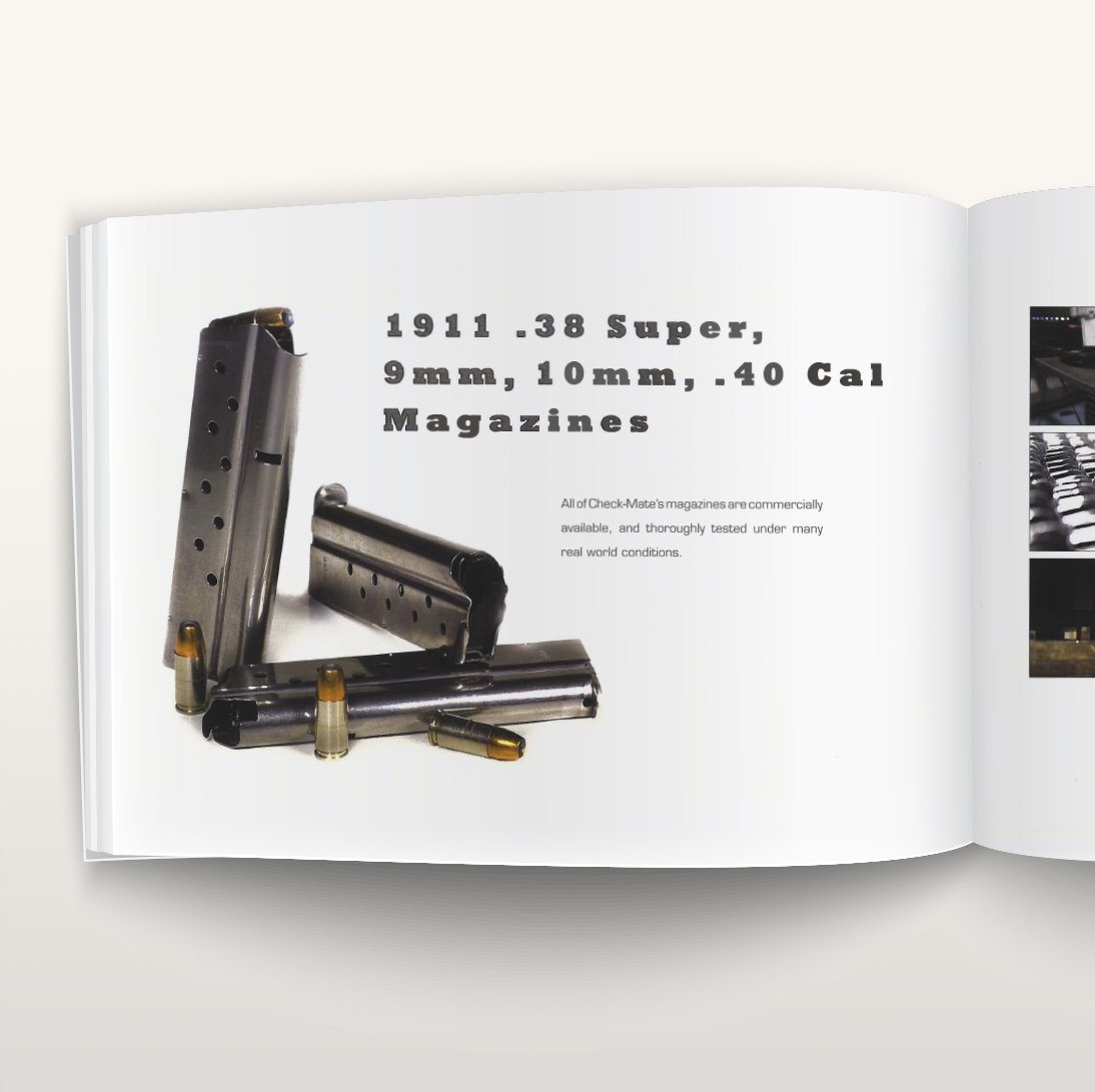
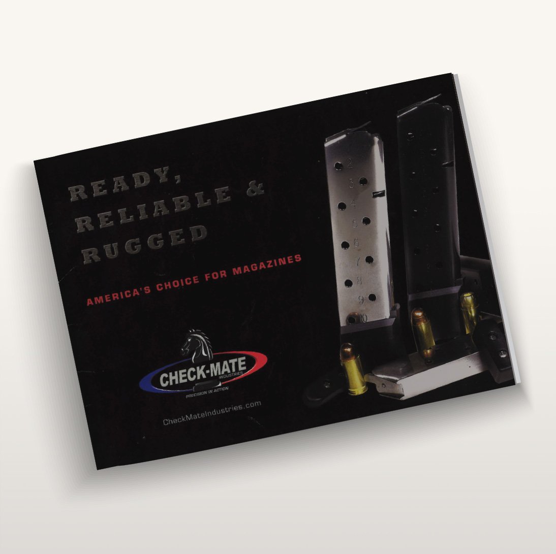
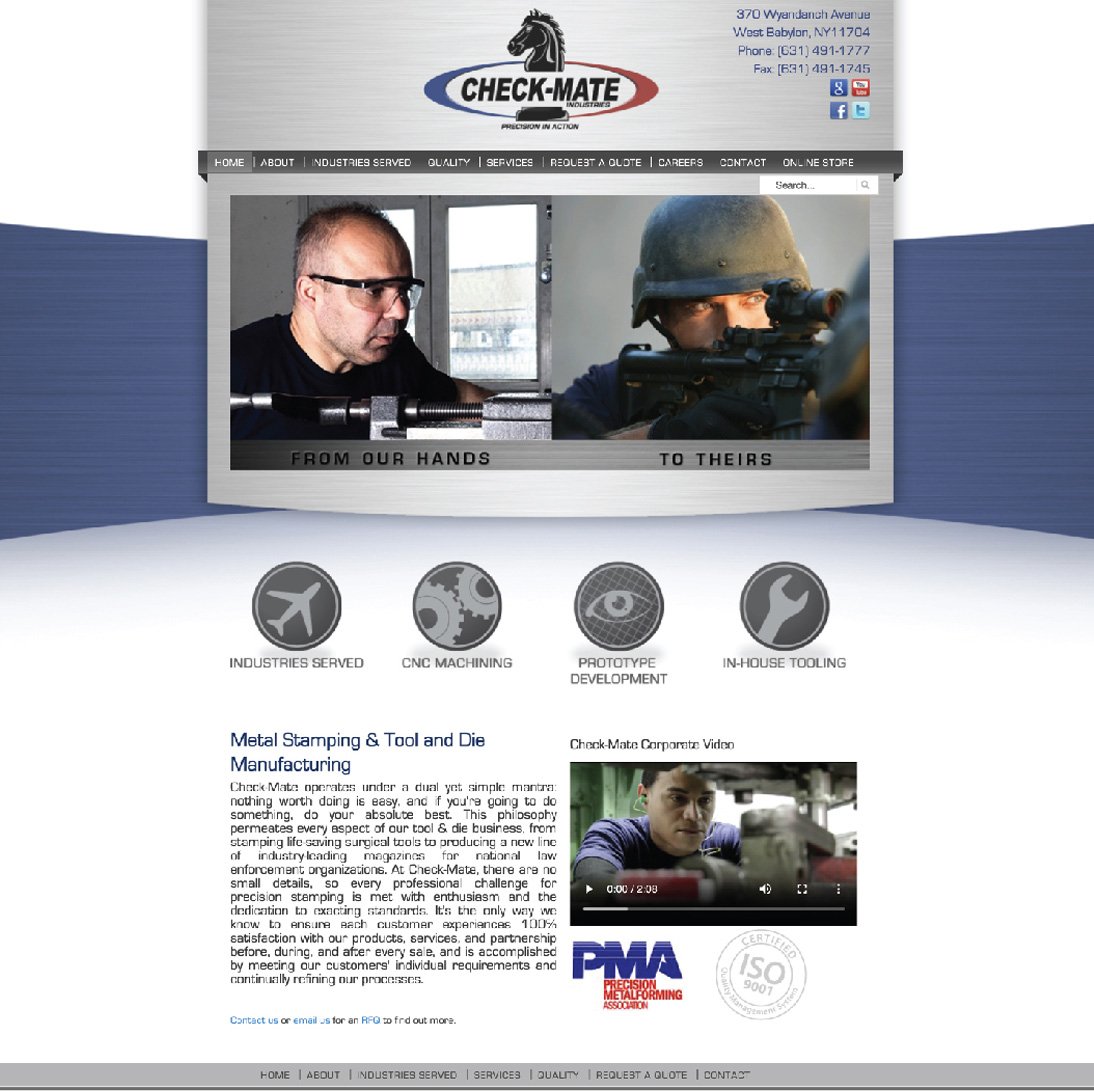
Checkmate Industries
Logo Redraw, Web Design & Brochure
At the time of this project I was part of a small local marketing team. My role for this project became working closely with the photographer, graphic designer, and account manager as I dictated page layouts, spreads, set up files and directed photography. A graphic designer on the team supplemented and fulfilled the layouts with copy and collages throughout the brochure. This publication followed a mild brand refresh and website redesign. While the logo simply required a redraw into a vector format the web design featured a new design from the ground up, featuring metallic textures, a simple color triad, and wide open space. The home page features space for a slideshow & video that was eventually prepared by a different team. Original iconography was created for this website reflecting the companies capabilities. Despite being one of my earliest web projects, it remains up and running.

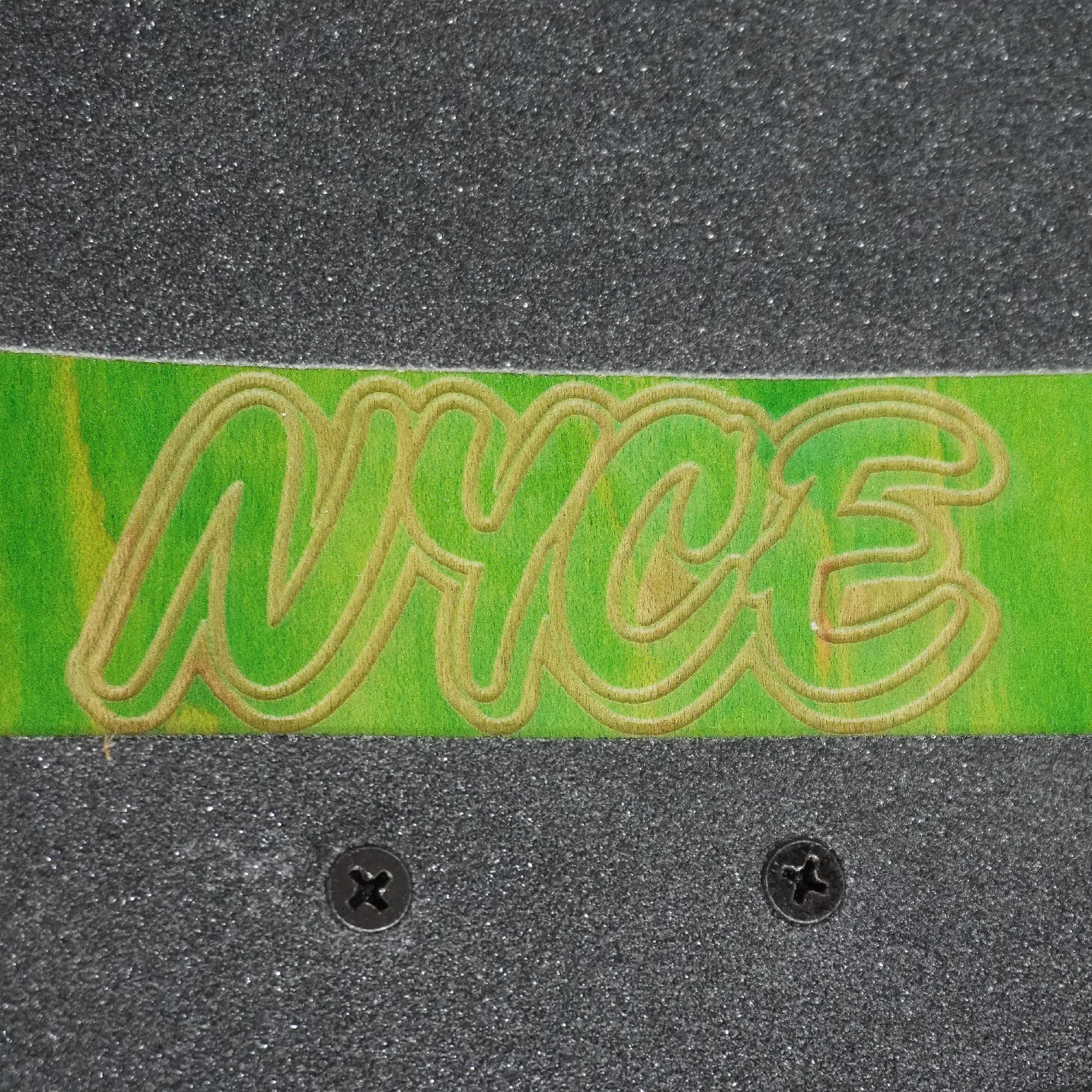
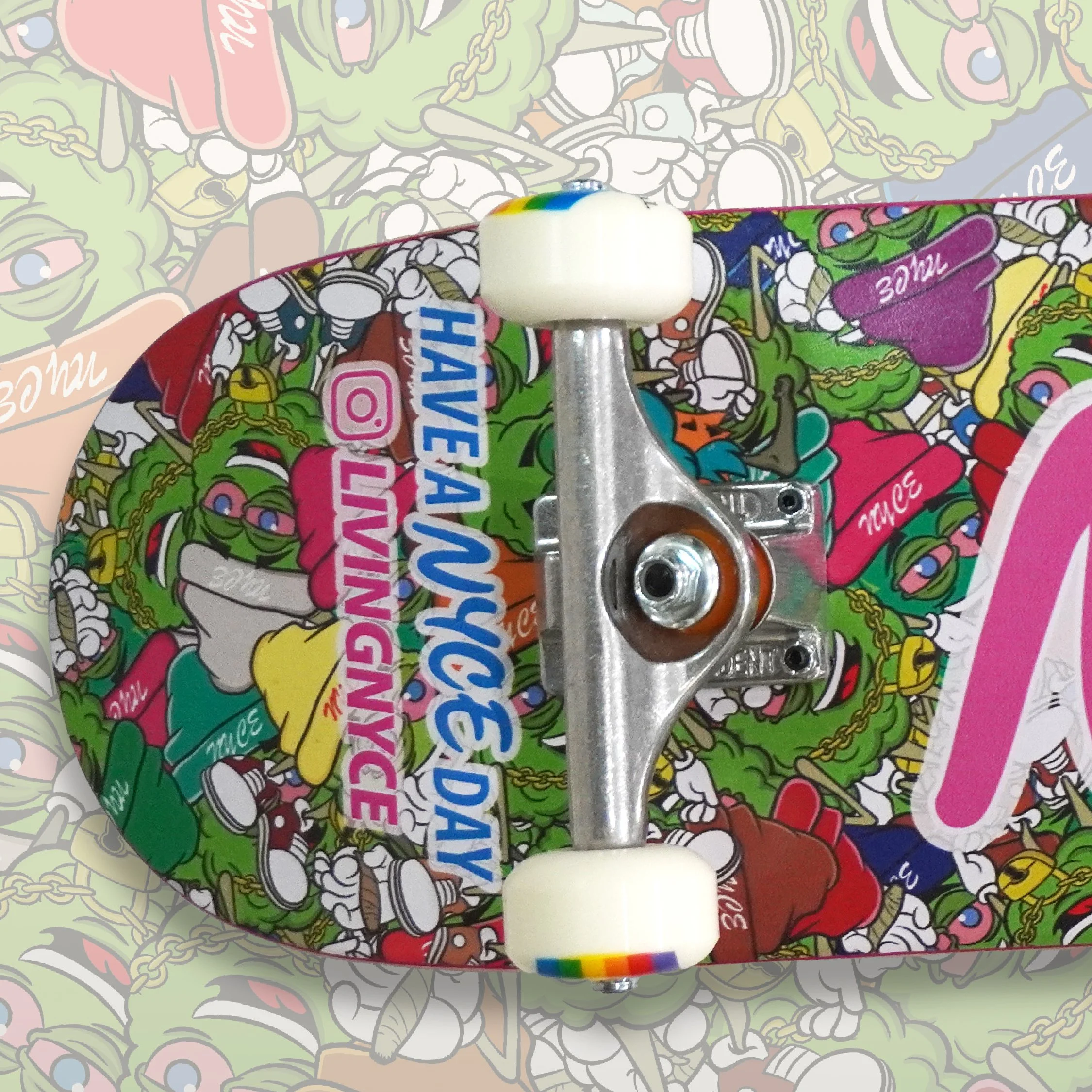
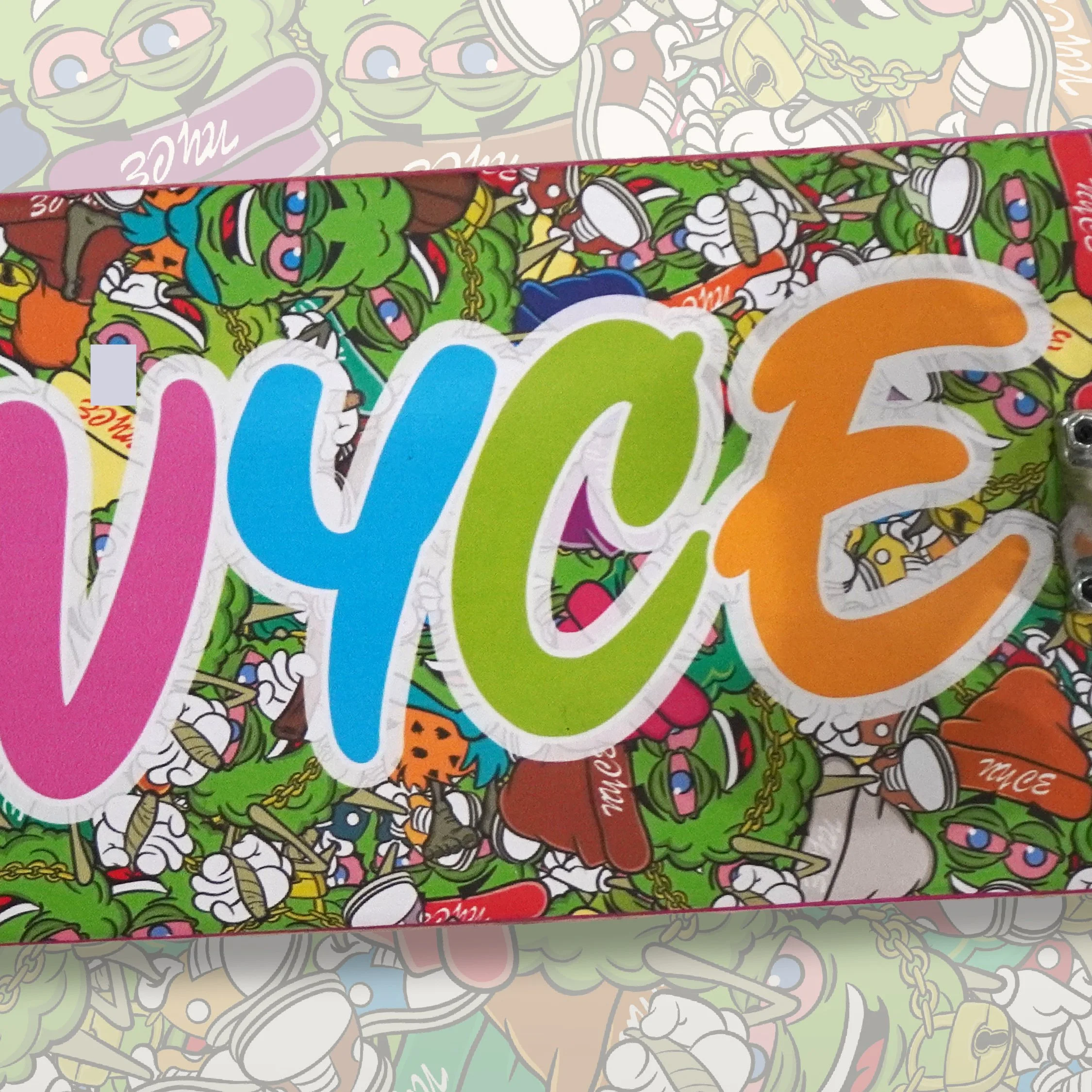
Living NYCE
Skateboard Marketing Concept
This skateboard was conceived to be used in a social media image campaign and served as a great conversation piece at cannabis shows. Although not yet exectuted, the image campaign aims to feature local talented skateboarders performing tricks around some new or popular products from the brand. A camouflage pattern was created using the brands mascots repeated and piled up. On either end of the skateboard design is featured the brand slogan and Instagram. In the center of the design in large bold colors is featured the NYCE logo. On the top side of the board an area is left without grip tape to reveal the NYCE logo laser etched into the surface. Eventually planned for a larger release this concept was entirely unlike anything cannabis brands either locally or abroad were offering. Quality hardware and colorful wheels were installed on the board for a stronger appearance and the best experience.